Full Screen Panel

*New Feature: Video support for YouTube and Vimeo Links

Style Options

  • Default
  • Fixed Background
  • Fancy

Additional Panel Options  

  • Hide Title: Hides item titles so you can keep the titles in Showtime for your reference but have them not display on the front end. 

Available Item Fields

  • Image (1600px by 1000px)
  • Title
  • Logo
  • Button Link
  • Button Text
  • Body
  • Video Background (YouTube and Vimeo links) supported

Full Screen Panel (Default)

  • Uses 1 item.
  • Supports both images*, YouTube, Vimeo, and muted mp4 background video. 

​​​​​​*Do not include text on the image itself as the image will crop based on browser width and height. Use the Item Title and Body fields to ensure text is viewable on all device sizes. 

Subtitle Goes Here

Title Goes Here

Pellentesque nibh sapien, congue in purus ut, mattis commodo ante. Duis dictum dolor in mi molestie laoreet at dapibus arcu. Nullam sit amet hendrerit ligula. Duis maximus purus vel ante volutpat mollis. Suspendisse suscipit eros vitae magna pharetra, non accumsan tellus consectetur. Quisque varius, enim sit amet aliquam laoreet, libero nibh dapibus nulla, non fringilla lectus nisl vel massa. Integer a purus libero.

Button 1Button 2Button 3

button text

Intro Panel (Default) w/Video (MP4, YouTube, or Vimeo)

New Feature: Video support for YouTube and Vimeo Links

  • Uses 1 Item.

  • When you set the Full Screen panel style to default, you can display a muted background video.

  • For MP4s, You’ll use the Add Media button next to "Image" to add your MP4. It's ok if you haven't uploaded the mp4 to the system yet, you will be able to do so from the media gallery after you've clicked Add Media. Try to keep your MP4 file size small to maintain a fast page load speed.

  • YouTube and Vimeo links are supported through the Video Background field.

  • Videos will autoplay without audio for accessibility.

​​​​​​*Do not include text on the image itself as the image will crop based on browser width and height. Use the Item Title and Body fields to ensure text is viewable on all device sizes. 

Title Goes Here

Full Screen Panel (Default) w/Title Hidden & a Logo 

  • Uses 1 Item.

  • Supports both images* and muted mp4 background video. 

  • Use the Add Media button below "Logo (optional)" to add your logo to the intro panel background. It's ok if you haven't uploaded it to the system yet, you will be able to do so from the media gallery after you've clicked Add Media. 

​​​​​​*Do not include text on the image itself as the image will crop based on browser width and height. Use the Item Title and Body fields to ensure text is viewable on all device sizes. 

Title Goes Here

Intro Panel (Fixed Background) 

  • Uses 1 Item.

  • Supports images* only. 

  • The background image does not move while the user scrolls.

​​​​​​*Do not include text on the image itself as the image will crop based on browser width and height. Use the Item Title and Body fields to ensure text is viewable on all device sizes. 

Title Goes Here

Intro Panel (Fancy) 

  • Use for multiple items. 

  • Supports images* only. 

  • The background fades to the next image as the text scrolls. 

​​​​​​*Do not include text on the image itself as the image will crop based on browser width and height. Use the Item Title and Body fields to ensure text is viewable on all device sizes. 

Vivamus ac tincidunt purus. Ut urna leo, blandit viverra pretium id, venenatis consequat est. Maecenas faucibus a justo id finibus. Aliquam eget feugiat purus. Morbi sed ligula eros. Donec mi est, egestas in mi at, varius semper dolor. Maecenas ac ex scelerisque, posuere quam in, feugiat nisl. In vel tortor vel magna vulputate condimentum quis et lacus.

Morbi sed ligula eros. Donec mi est, egestas in mi at, varius semper dolor. Maecenas ac ex scelerisque, posuere quam in, feugiat nisl. In vel tortor vel magna vulputate condimentum quis et lacus. Vivamus ac tincidunt purus. Ut urna leo, blandit viverra pretium id, venenatis consequat est. Maecenas faucibus a justo id finibus. Aliquam eget feugiat purus.

Vivamus ac tincidunt purus. Ut urna leo, blandit viverra pretium id, venenatis consequat est. Maecenas faucibus a justo id finibus. Aliquam eget feugiat purus. Morbi sed ligula eros. Donec mi est, egestas in mi at, varius semper dolor. Maecenas ac ex scelerisque, posuere quam in, feugiat nisl. In vel tortor vel magna vulputate condimentum quis et lacus.

Grid Panel

Style Options

  • Default
  • Carousel

Available Item Fields

  • Image (410px by 245px)
  • Title
  • Subtitle
  • URL
  • Button Text
     

Grid Panel (Default) 

  • Use 3 items minimum (If you use less than 3 the panel will not look nice on desktop)
  • If a URL is entered the whole item square will be clickable.
  • On tablet/mobile items will stack.
     

Grid Panel (Carousel)

  • Use more than 3 items
  • If a URL is entered the whole item square will be clickable.
  • On desktop adds arrows to the left and right for the user to toggle through items.
  • On tablet/mobile the user can swipe left and right through the items.

Title Goes Here

Subtitle Goes Here

Title Goes Here

Subtitle Goes Here

Spotlight Panel

*New Features: 4-Across and 5-Across options

Style Options

  • Large
  • Wide
  • Grid
  • 4-Across
  • 5-Across

Available Item Fields

  • Image (820px by 490px)
  • Title
  • Body
  • URL
  • Button Text
     

Spotlight Panel (Large) 

  • Use 2 items minimum (If you use less than 2 the panel will not look nice on desktop)
  • Displays 2 items across on desktop.

Spotlight Panel (Wide)

  • Displays 1 item across on desktop.

Spotlight with Image, Link, and Description

In this format, the image, title, and button will be clickable.

You can include bulleted and numbered lists within a spotlight and even a link within the text.

  • Bulleted Item 1
  • Bulleted Item 2
  • Bulleted Item 3
  1. Numbered Item 1
  2. Numbered Item 2
  3. Numbered Item 3
Sample Button Text

Spotlight with Image, Description, and NO Link

You don't have to include a link. If you don't, no button will appear.

Spotlight with description, link, and NO image

If you don't have an image, but still like the way the spotlight list looks, that's fine! Go ahead and create your spotlight without an image. In this case, just the title and button will be clickable. 

More Info

Spotlight Panel (Grid)

  • Use 3 items minimum (If you use less than 3 the panel will not look nice on desktop)
  • Displays 3 items across on desktop.

Title Goes Here

Lorem ipsum dolor sit amet, consectetur adipiscing elit. Sed condimentum ornare lacinia. Integer posuere quis libero sit amet pulvinar. Donec quis aliquet turpis, accumsan pellentesque massa. Pellentesque nec tortor eu orci cursus rutrum. In at erat nulla. Donec sed condimentum magna, eu lacinia erat. Vivamus volutpat id mi nec eleifend.

Sample Button Text

Title Goes Here

Lorem ipsum dolor sit amet, consectetur adipiscing elit. Sed condimentum ornare lacinia. Integer posuere quis libero sit amet pulvinar. Donec quis aliquet turpis, accumsan pellentesque massa. Pellentesque nec tortor eu orci cursus rutrum. In at erat nulla. Donec sed condimentum magna, eu lacinia erat. Vivamus volutpat id mi nec eleifend.

Sample Button Text

Title Goes Here

Lorem ipsum dolor sit amet, consectetur adipiscing elit. Sed condimentum ornare lacinia. Integer posuere quis libero sit amet pulvinar. Donec quis aliquet turpis, accumsan pellentesque massa. Pellentesque nec tortor eu orci cursus rutrum. In at erat nulla. Donec sed condimentum magna, eu lacinia erat. Vivamus volutpat id mi nec eleifend.

Sample Button Text

Spotlight Panel (4 Across)

New Feature

  • Use 4 items minimum (If you use less than 4, the panel will not look nice on desktop)
  • Displays 4 items across on desktop.

Title Goes Here

Lorem ipsum dolor sit amet, consectetur adipiscing elit. Sed condimentum ornare lacinia.

Button Text

Title Goes Here

Lorem ipsum dolor sit amet, consectetur adipiscing elit. Sed condimentum ornare lacinia.

Button Text

Title Goes Here

Lorem ipsum dolor sit amet, consectetur adipiscing elit. Sed condimentum ornare lacinia.

Button Text

Title Goes Here

Lorem ipsum dolor sit amet, consectetur adipiscing elit. Sed condimentum ornare lacinia.

Button Text

Spotlight Panel (5 Across)

New Feature

  • Use 5 items minimum (If you use less than 5, the panel will not look nice on desktop)
  • Displays 5 items across on desktop.

Title Goes Here

Lorem ipsum dolor sit amet, consectetur adipiscing elit. Sed condimentum ornare lacinia.

Button Text

Title Goes Here

Lorem ipsum dolor sit amet, consectetur adipiscing elit. Sed condimentum ornare lacinia.

Button Text

Title Goes Here

Lorem ipsum dolor sit amet, consectetur adipiscing elit. Sed condimentum ornare lacinia.

Button Text

Title Goes Here

Lorem ipsum dolor sit amet, consectetur adipiscing elit. Sed condimentum ornare lacinia.

Button Text

Title Goes Here

Lorem ipsum dolor sit amet, consectetur adipiscing elit. Sed condimentum ornare lacinia.

Button Text

Full Width Panel

*New Feature: Video support for YouTube and Vimeo Links

Style Options

  • No style options display as it is just default. 

Additional Panel Options

  • Is Carousel?: Select to have the panel carousel through multiple items.  
  • Hide Title: Hides item titles so you can keep the titles in Showtime for your reference but have them not display on the front end. 
  • Show Text On Hover: Instead of the Title, Body Text, and Button displaying automatically, they appear on hover. ​

Available Item Fields

  • Image (1200px by 700px)
  • Title
  • URL
  • Body
  • Button Text
  • Video Background (YouTube and Vimeo links) supported

Full Width Panel w/Carousel

  • Check Is Carousel? under panel options if using more than 2 items. 
  • Max of 4 items in carousel. 
Subtitle Goes Here

Title Goes Here

Lorem ipsum dolor sit amet, consectetur adipiscing elit. Mauris pharetra nulla quis blandit sollicitudin. Pellentesque suscipit, odio laoreet vulputate efficitur, nulla velit mattis magna, non fringilla justo lacus ut orci. Ut aliquam, elit nec imperdiet lacinia, leo erat maximus eros, a imperdiet quam sapien eu ante. Praesent iaculis neque ac dolor scelerisque tristique. 

Subtitle Goes Here

Title Goes Here

Lorem ipsum dolor sit amet, consectetur adipiscing elit. Mauris pharetra nulla quis blandit sollicitudin. Pellentesque suscipit, odio laoreet vulputate efficitur, nulla velit mattis magna, non fringilla justo lacus ut orci. Ut aliquam, elit nec imperdiet lacinia, leo erat maximus eros, a imperdiet quam sapien eu ante. Praesent iaculis neque ac dolor scelerisque tristique. 

Subtitle Goes Here

Title Goes Here

Lorem ipsum dolor sit amet, consectetur adipiscing elit. Mauris pharetra nulla quis blandit sollicitudin. Pellentesque suscipit, odio laoreet vulputate efficitur, nulla velit mattis magna, non fringilla justo lacus ut orci. Ut aliquam, elit nec imperdiet lacinia, leo erat maximus eros, a imperdiet quam sapien eu ante. Praesent iaculis neque ac dolor scelerisque tristique. 

Subtitle Goes Here

Title Goes Here

Lorem ipsum dolor sit amet, consectetur adipiscing elit. Mauris pharetra nulla quis blandit sollicitudin. Pellentesque suscipit, odio laoreet vulputate efficitur, nulla velit mattis magna, non fringilla justo lacus ut orci. Ut aliquam, elit nec imperdiet lacinia, leo erat maximus eros, a imperdiet quam sapien eu ante. Praesent iaculis neque ac dolor scelerisque tristique. 

Full Width Panel w/Title Hidden

  • Check Hide Title under panel options.
  • Leave Use Carousel? unchecked to display stacked panels
Subtitle Goes Here

Lorem ipsum dolor sit amet, consectetur adipiscing elit. Mauris pharetra nulla quis blandit sollicitudin. Pellentesque suscipit, odio laoreet vulputate efficitur, nulla velit mattis magna, non fringilla justo lacus ut orci. Ut aliquam, elit nec imperdiet lacinia, leo erat maximus eros, a imperdiet quam sapien eu ante. Praesent iaculis neque ac dolor scelerisque tristique. 

Full Width Panel w/Show Text on Hover

  • Check Show Text on Hover under panel options to have the title, body text, and button display on hover only. 

Title Goes Here

This caption will fade in. 

Full Width Panel with Video

New Feature

  • Add a YouTube or Vimeo video link in the Video Background field to display a video in this panel.
  • The video will autoplay without sound for accessibility.

Alternating Panel

*New Features: Video support for YouTube and Vimeo Links | Modal Option

Style Options

  • Default
  • Small
  • Centered Logos
  • Fixed Width
  • Modal

Available Item Fields

  • Image (800px by 800px)
  • Title
  • URL
  • Body
  • Button Text
  • Video Background (YouTube and Vimeo links supported)
  • Read More Text (for Modal option)

Alternating Panel (Default) 

  • The first item displays the image* on the left and the text on the right. The next item displays in the reverse order and so on.

​​​​​​*Do not include text on the image itself as the image will crop based on browser width and height. Use the Item Title and Body fields to ensure text is viewable on all device sizes. 

Subtitle Goes Here

Title Goes Here

Subtitle Goes Here

Title Goes Here

Lorem ipsum dolor sit amet, consectetur adipiscing elit. Mauris pharetra nulla quis blandit sollicitudin. Pellentesque suscipit, odio laoreet vulputate efficitur, nulla velit mattis magna, non fringilla justo lacus ut orci. Ut aliquam, elit nec imperdiet lacinia, leo erat maximus eros, a imperdiet quam sapien eu ante. Praesent iaculis neque ac dolor scelerisque tristique. 

  • Lorem ipsum dolor sit amet,
  • consectetur adipiscing elit
  • neque ac dolor scelerisque tristique
More Info
Subtitle Goes Here

Title Goes Here

Title Goes Here

Lorem ipsum dolor sit amet, consectetur adipiscing elit.

Mauris pharetra nulla quis blandit sollicitudin. Pellentesque suscipit, odio laoreet vulputate efficitur, nulla velit mattis magna, non fringilla justo lacus ut orci. Ut aliquam, elit nec imperdiet lacinia, leo erat maximus eros, a imperdiet quam sapien eu ante. Praesent iaculis neque ac dolor scelerisque tristique.

Alternating Panel (Small) 

  • The first item displays the image* on the left and the text on the right. The next item displays in the reverse order and so on.
  • Image height is shorter than the default alternating panel. 

​​​​​​*Do not include text on the image itself as the image will crop based on browser width and height. Use the Item Title and Body fields to ensure text is viewable on all device sizes. 

Subtitle Goes Here

Title Goes Here

Lorem ipsum dolor sit amet, consectetur adipiscing elit. Aenean euismod, metus quis volutpat varius, mi erat elementum elit, sollicitudin congue eros mauris sed mauris. Nullam eget nunc ultrices, fermentum sem eu, finibus nisi. Etiam interdum facilisis orci vitae bibendum. Pellentesque id finibus magna. Fusce ante odio, commodo eu libero nec, placerat maximus mauris.

Title Goes Here

Ut a dolor turpis. Sed luctus pellentesque semper. Proin nec eleifend magna. Donec cursus, justo eget viverra finibus, metus leo congue magna, sit amet tincidunt orci metus et lectus. Sed faucibus libero justo, non vehicula mi pretium nec. Nullam sed elit mi. Phasellus massa metus, consectetur vel sagittis et, posuere et tellus. Fusce blandit felis id risus fermentum iaculis.

Alternating Panel (Centered Logos) 

  • The first item displays the logo centered on the left and the text on the right. The next item displays in the reverse order and so on.

Title Goes Here

Title Goes Here

Lorem ipsum dolor sit amet, consectetur adipiscing elit. Aenean euismod, metus quis volutpat varius, mi erat elementum elit, sollicitudin congue eros mauris sed mauris. Nullam eget nunc ultrices, fermentum sem eu, finibus nisi. Etiam interdum facilisis orci vitae bibendum. Pellentesque id finibus magna. Fusce ante odio, commodo eu libero nec, placerat maximus mauris.

Alternating Panel (Fixed Width) 

  • The first item displays the image* on the left and the text on the right. The next item displays in the reverse order and so on.
  • The items remain centered on the page in desktop view. 
  • Image height adjusts based on coordinating text length.

​​​​​​*Do not include text on the image itself as the image will crop based on browser width and height. Use the Item Title and Body fields to ensure text is viewable on all device sizes. 

Title Goes Here

Lorem ipsum dolor sit amet, consectetur adipiscing elit. Aenean euismod, metus quis volutpat varius, mi erat elementum elit, sollicitudin congue eros mauris sed mauris. 

Title Goes Here

Lorem ipsum dolor sit amet, consectetur adipiscing elit. Aenean euismod, metus quis volutpat varius, mi erat elementum elit, sollicitudin congue eros mauris sed mauris.

Title Goes Here

Lorem ipsum dolor sit amet, consectetur adipiscing elit. Aenean euismod, metus quis volutpat varius, mi erat elementum elit, sollicitudin congue eros mauris sed mauris.

Title Goes Here

Lorem ipsum dolor sit amet, consectetur adipiscing elit. Aenean euismod, metus quis volutpat varius, mi erat elementum elit, sollicitudin congue eros mauris sed mauris.

Alternating Panel (Video Support) 

New Feature

  • Videos can be used in place of images for any layout of Alternating Panels.
  • MP4s can be uploaded into the Image field.
  • YouTube and Vimeo links are supported through the Video Background field.
  • Images will autoplay without audio for accessibility.

MP4 Video

Vimeo Video

YouTube Video

Alternating Panel (Modal Option) 

New Feature

  • A modal option can be used with Alternating Panels to allow a pop of text and/or images to display.
  • To activate the modal, add text and/or images to the "Read More Text" field.
  • A "Read More" button will automatically display for the user to open up the modal.
  • If the URL field is also filled out, the "Read More" button will display next to the button for the URL field.

This will have a Modal

This Panel will have a model.

Icons Panel

Style Options

  • No style options display as it is just default. 

Additional Panel Options

  • Hide Title: Hides item titles so you can keep the titles in Showtime for your reference but have them not display on the front end. 

Available Item Fields

  • Image (Any Size)
  • Title
  • URL
  • Body

Icons Panel w/7 items

  • You can use any number of items as the icons center up on desktop.

Title Goes Here

Lorem ipsum dolor sit amet, consectetur adipiscing elit. Integer semper interdum tempor.

Title Goes Here

Lorem ipsum dolor sit amet, consectetur adipiscing elit. Integer semper interdum tempor.

Title Goes Here

Lorem ipsum dolor sit amet, consectetur adipiscing elit. Integer semper interdum tempor.

Title Goes Here

Lorem ipsum dolor sit amet, consectetur adipiscing elit. Integer semper interdum tempor.

Title Goes Here

Lorem ipsum dolor sit amet, consectetur adipiscing elit. Integer semper interdum tempor.

Title Goes Here

Lorem ipsum dolor sit amet, consectetur adipiscing elit. Integer semper interdum tempor.

Title Goes Here

Lorem ipsum dolor sit amet, consectetur adipiscing elit. Integer semper interdum tempor.

Icons Panel w/3 items & Titles Hidden

  • Check Hide Title under panel options.
  • Add 3 items. 

Icons Panel w/2 items

  • Add 2 items. 

Title Goes Here

Lorem ipsum dolor sit amet, consectetur adipiscing elit. Integer semper interdum tempor.

Title Goes Here

Lorem ipsum dolor sit amet, consectetur adipiscing elit. Integer semper interdum tempor.

Icons Panel w/3 items

  • Add 3 items. 

Title Goes Here

Lorem ipsum dolor sit amet, consectetur adipiscing elit. Integer semper interdum tempor.

Title Goes Here

Lorem ipsum dolor sit amet, consectetur adipiscing elit. Integer semper interdum tempor.

Title Goes Here

Lorem ipsum dolor sit amet, consectetur adipiscing elit. Integer semper interdum tempor.

Banners Panel

Style Options

  • No style options display as it is just default. 

Additional Panel Options  

  • Hide Title: Hides item titles so you can keep the titles in Showtime for your reference but have them not display on the front end. 

Available Item Fields

  • Image
    • 1 item (1300px by 220px)
    • 2 items (750px by 220px)
    • 3 items (400px by 220px)
  • Title
  • URL
  • Logo

Banners Panel w/1 item

  • Add 1 item
  • If including an image use (1300px by 220px)

Banners Panel w/2 items & Titles Hidden

  • Check Hide Title under panel options.
  • Add 2 items. 
  • If including an image use (750px by 220px for each)

Banners Panel w/3 items

  • Add 3 items. 
  • If including an image use (400px by 220px for each)

Title Goes Here

Subtitle Goes Here

Title Goes Here

Subtitle Goes Here

Title Goes Here

Subtitle Goes Here

Text Only Panel

Style Options

  • Default
  • Centered

Available Item Fields

  • Title (Showtime Use Only. Not visible on Front End)
  • Text

Text Only Panel (Default)

  • Text is Left-Aligned.

Heading 1

Lead-In Paragraph: Write out your text then highlight it. In the text editor, click the STYLES button and choose "lead paragraph."

Heading 2

Normal Font: Bold text italicized text subscript superscript. This is the default for text. When you create a new text item and start typing, this is the text that will appear on the front end of your site unless you choose an alternate text style. You can choose styles by clicking on the Paragraph Format button in the text editor (the first dropdown in from the left, it will say "Normal.") From there, you can choose a heading type or you can choose from various other styles like Lead Paragraph (displayed above), bold, italicized, subscript, superscript, numbered and bulleted lists, or blockquotes, all of which are sampled on this page.


Heading 3

Bulleted and numbered lists can be created in any text block. Simply write out the list of items, highlight them, and then click on the bulleted list icon or the numbered list icon in the text editor. The list will automatically add the numbers/bullets to each item.

  • Bulleted Item 1
  • Bulleted Item 2
  • Bulleted Item 3
  • Bulleted Item 4
  1. Numbered Item 1
  2. Numbered Item 2
  3. Numbered Item 3
  4. Numbered Item 4

Buttons

Create new buttons within text panel items. Type out the word(s) you would like to use as the button text, click on the link icon in the text editor, and fill in the information to create the link. Click on the Advanced tab and in the field labeled "stylesheet class" type the word "button" (without the quotation marks), click ok. It will look like a regular text link within Showtime, but on the front end, it will be styled like a button.

Sample Button

Styled Image Right

casey-horner-1533985-unsplash.jpgPlace your cursor at the start of the paragraph. Click on the Media button and choose your image. Once it appears in the text block, click on the image so it highlights, go to the Styles button in the text editor and choose styled image right. 

Styled Image Left

casey-horner-1533985-unsplash.jpg

Place your cursor at the start of the paragraph. Click on the Media button and choose your image. Once it appears in the text block, click on the image so it highlights, go to the Styles button in the text editor and choose either styled image left or styled image right. 

Text Only Panel (Centered)

  • Text is Centered.

Creating Buttons

Create new buttons within text panel items. Navigate your cursor to the spot where you would like the button to display. Click on the Button button in the text editor. A new menu will appear above your work, prompting you to enter the text (button text) and the URL, and to choose to open in a new window if desired. Click ok to save. 

ButtonAnother Button

Bulleted and numbered lists can be created in any text panel. Simply write out the list of items, highlight them, and click on the bulleted list icon or the numbered list icon in the text editor. The list will automatically add the numbers/bullets to each item.

  • Bulleted Item 1
  • Bulleted Item 2
  • Bulleted Item 3
  • Bulleted Item 4
  1. Numbered Item 1
  2. Numbered Item 2
  3. Numbered Item 3
  4. Numbered Item 4

FAQ List Panel

Style Options

  • No style options display as it is just default. 

Available Item Fields

  • Question
  • Answer

FAQ List Panel Notes

FAQ list panels are a great way to break up text within a page to make it more manageable for the reader. Click edit on the first item and enter a question (does not necessarily have to be a question) then use the free form answer description field for all of the information related to that question. Select the + Add New Item button to add additional FAQ items.

FAQ List Panel

  • FAQ list panels are a great way to break up text within a page to make it more manageable for the reader. Click edit on the first item and enter a question (does not necessarily have to be a question) then use the free form answer description field for all of the information related to that question. Select the + Add New Item button to add additional FAQ items.

Sample Item 1

Sample Answer. Lorem ipsum dolor sit amet, consectetur adipiscing elit. Mauris id augue non mauris volutpat faucibus. Vestibulum varius eget nisl id rhoncus. Suspendisse id consequat justo. Maecenas non tellus convallis, aliquet sapien sed, pharetra quam. Praesent ultrices ac magna nec gravida. Aenean nec sodales sapien, vel consequat mi.
Integer eu porta orci. Class aptent taciti sociosqu ad litora torquent per conubia nostra, per inceptos himenaeos.

Sample Item 2

This is another example. This one includes a link within the text and some lists. 

  • Bulleted Item 1
  • Bulleted Item 2
  • Bulleted Item 3
  1. Numbered Item 1
  2. Numbered Item 2
  3. Numbered Item 3

Link List Panel

Style Options

  • No style options display as it is just default. 

Available Item Fields

  • Title
  • URL
  • Body

Link List Panel Notes

If you have a list of items that you want to link, a link list is a better alternative than simply linking within a text panel. Click edit on the first item. The Title field is where you place the word(s) that represent your link, then enter the link in the URL field. The body field is optional. As shown below, bulleted and numbered lists are supported here as well as links within the text.

HTML Panel

New Panel

This content item allows raw HTML, CSS, and JavaScript code. Content will be rendered directly without modification. 

Note: Use caution with scripts.

Style Options

  • Fixed Width (1180px)
  • Full Width 
{HTML Goes Here}

Spacer Panel

New Panel

  • Small (50px)
  • Medium (100px)
  • Large (200px)

Note: Spacer will add additional space in addition to your existing site spacing

Spacer Small (50px)

Spacer Medium (100px)

Spacer Large (200px)

Events

  • Full Width
  • Carousel
  • Adaptive
  • Small

Upcoming Events

More Info for Lana White & The Heights
FridaySeptember 11, 2026
Sponsor Inc.

Lana White & The Heights

This is Tagline

More Info for Melissa Etheridge
SundaySeptember 20, 2026

Melissa Etheridge

RISE

More Info for Lonestar
ThursdaySeptember 24, 2026

Lonestar

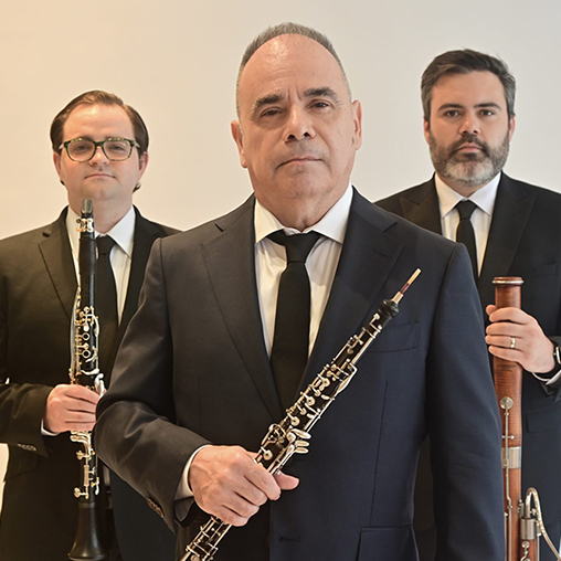
More Info for Vitamin String Quartet
MondaySeptember 28, 2026

Vitamin String Quartet

More Info for Dionne Warwick
ThursdayOctober 1, 2026

Dionne Warwick

with the ATL Pops Strings Ensemble

More Info for Jersey Boys: The Broadway Musical
SundayOctober 4, 2026

Jersey Boys: The Broadway Musical

The National Broadway Tour

More Info for Jefferson Starship
TuesdayOctober 6, 2026

Jefferson Starship

More Info for Blackhawk
ThursdayOctober 8, 2026

Blackhawk

More Info for Midnight on Main
SaturdayOctober 10, 2026

Midnight on Main

Presented by ALEAF

More Info for Old Crow Medicine Show: Union Made Tour
TuesdayOctober 13, 2026

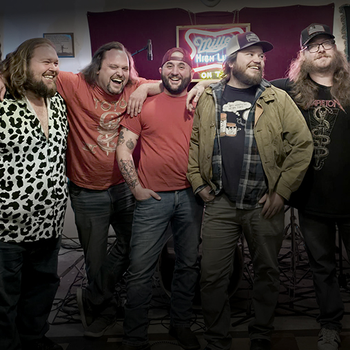
Old Crow Medicine Show: Union Made Tour

with special guest Palmyra

More Info for Smokey Robinson
October 15 - 16, 2026

Smokey Robinson

More Info for Jay Leno
SundayOctober 18, 2026

Jay Leno

More Info for The Dolphins Quartet
TuesdayOctober 20, 2026

The Dolphins Quartet

More Info for Tim Lovelace
ThursdayOctober 22, 2026

Tim Lovelace

10 x 10 Series

More Info for Bill Engvall
FridayOctober 23, 2026

Bill Engvall

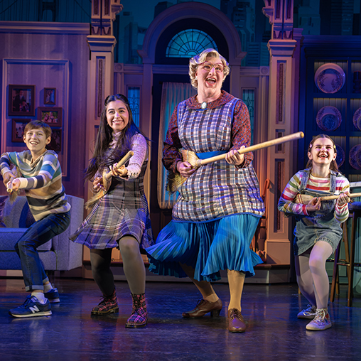
More Info for Mrs. Doubtfire: The Broadway Musical
TuesdayOctober 27, 2026

Mrs. Doubtfire: The Broadway Musical

The National Broadway Tour

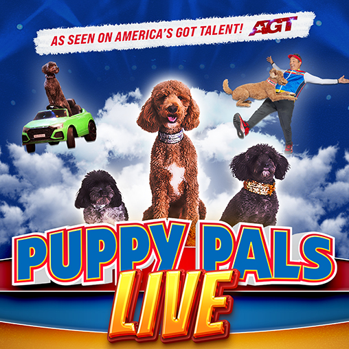
More Info for Puppy Pals
MondayNovember 2, 2026

Puppy Pals

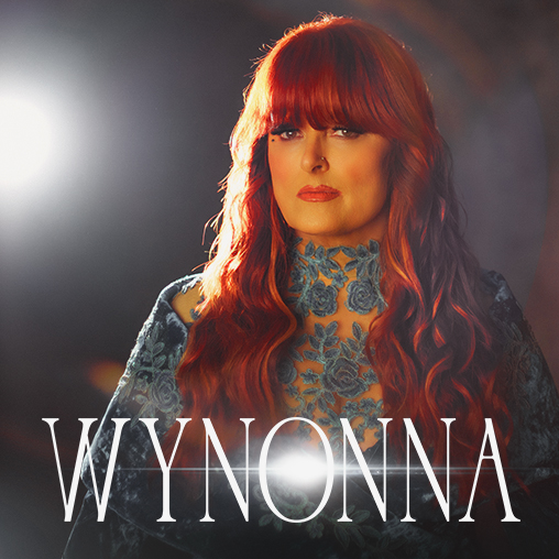
More Info for Wynonna: The Hard Truth Tour
FridayNovember 6, 2026

Wynonna: The Hard Truth Tour

with special guest Troubadour Blue

More Info for Jazz at OPAC
ThursdayNovember 12, 2026

Jazz at OPAC

Swing

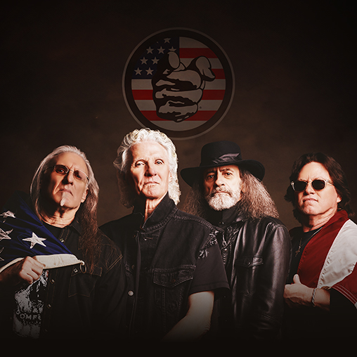
More Info for Grand Funk Railroad
SundayNovember 15, 2026

Grand Funk Railroad

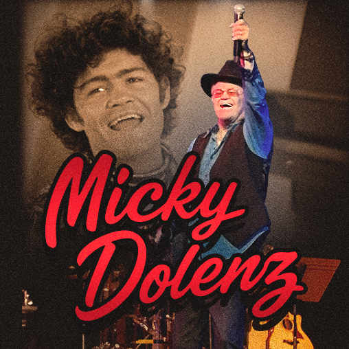
More Info for Micky Dolenz
FridayNovember 20, 2026

Micky Dolenz

60 YEARS OF THE MONKEES

More Info for Edward Arthell Protho and Norman Dennis
ThursdayDecember 3, 2026

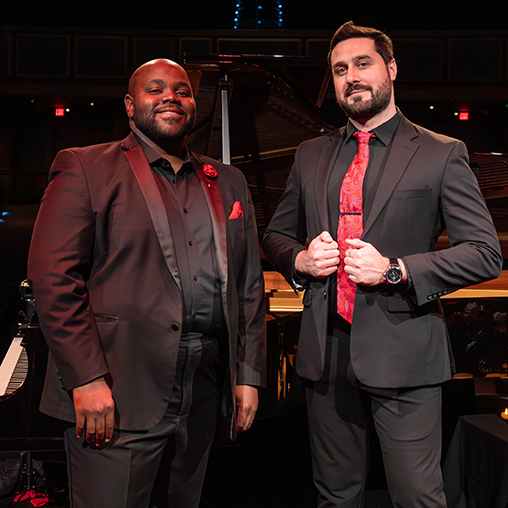
Edward Arthell Protho and Norman Dennis

10x10 Series

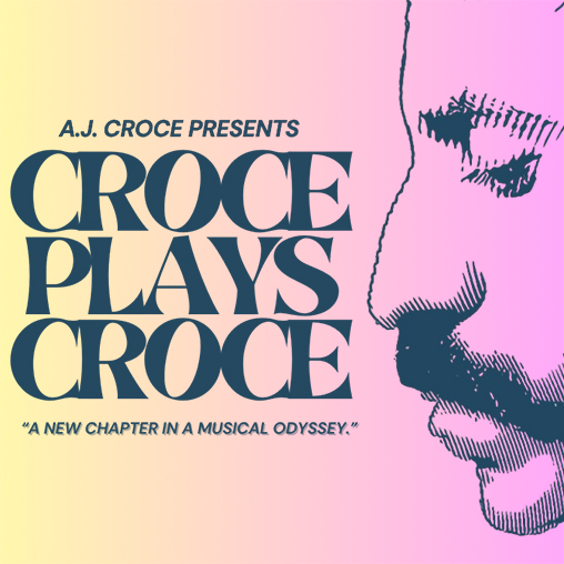
More Info for Croce Plays Croce
SundayDecember 6, 2026

Croce Plays Croce

More Info for It's A Wonderful Life
MondayDecember 21, 2026

It's A Wonderful Life

The Motion Picture

More Info for Dr. Seuss' How The Grinch Stole Christmas
TuesdayDecember 22, 2026

Dr. Seuss' How The Grinch Stole Christmas

The Motion Picture

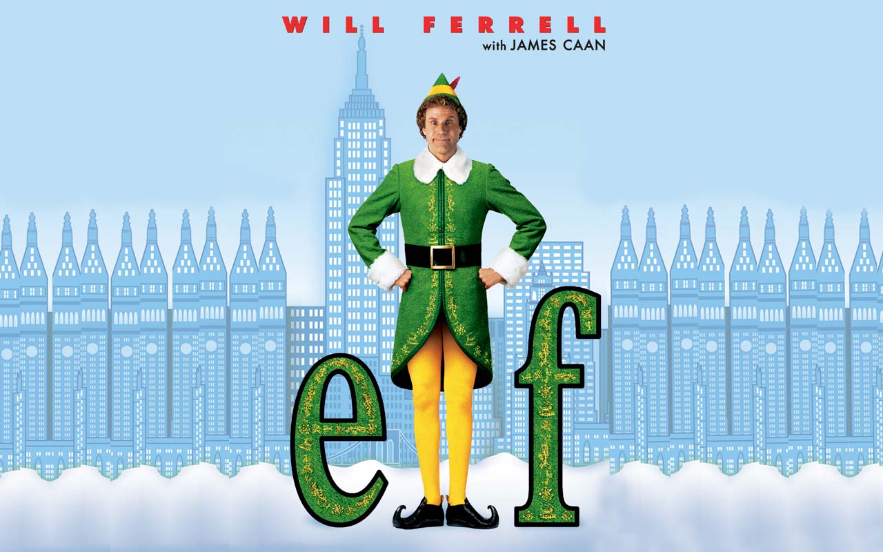
More Info for ELF
WednesdayDecember 23, 2026

ELF

The Motion Picture

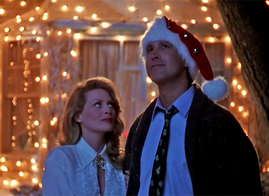
More Info for Christmas Vacation
ThursdayDecember 24, 2026

Christmas Vacation

The Motion Picture (PG-13)

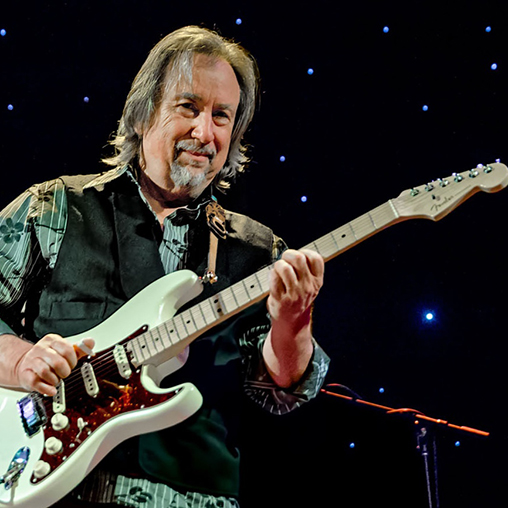
More Info for Jim Messina
ThursdayJanuary 7, 2027

Jim Messina

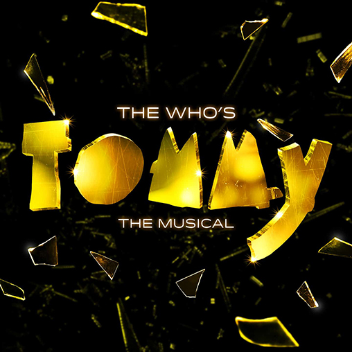
More Info for The Who's Tommy: The Musical
ThursdayJanuary 21, 2027

The Who's Tommy: The Musical

The National Broadway Tour

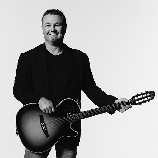
More Info for Edwin McCain
SaturdayJanuary 23, 2027

Edwin McCain

More Info for Highway Static
FridayJanuary 29, 2027

Highway Static

10x10 Series

More Info for American Pop
ThursdayFebruary 4, 2027

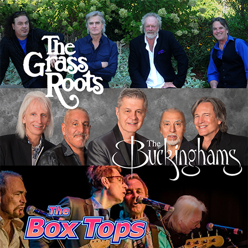
American Pop

Featuring the Grass Roots, The Buckinghams, and The Box Tops

More Info for Gilbert & Sullivan's Pirates of Penzance
SaturdayFebruary 6, 2027

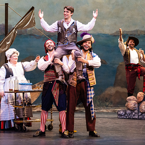
Gilbert & Sullivan's Pirates of Penzance

The National Broadway Tour

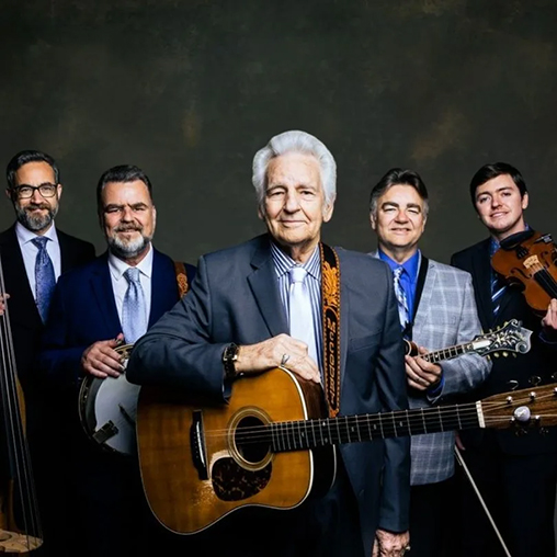
More Info for The Del McCoury Band
FridayFebruary 12, 2027

The Del McCoury Band

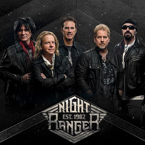
More Info for Night Ranger
ThursdayFebruary 25, 2027

Night Ranger

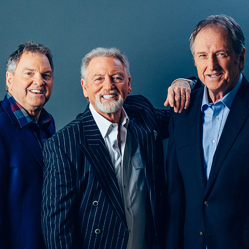
More Info for Gatlin Brothers
SaturdayMarch 6, 2027

Gatlin Brothers

More Info for The Band Perry
SundayMarch 7, 2027

The Band Perry

More Info for Avenue South
FridayMarch 12, 2027

Avenue South

10x10 Series

More Info for Mark Twain Tonight!
SaturdayMarch 13, 2027

Mark Twain Tonight!

More Info for Blues Deluxe
ThursdayMarch 18, 2027

Blues Deluxe

10x10 Series

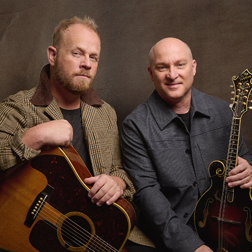
More Info for Dailey & Vincent
FridayMarch 19, 2027

Dailey & Vincent

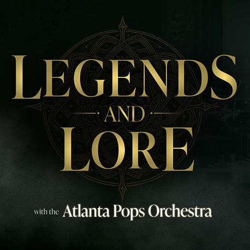
More Info for Legends and Lore
SundayMarch 21, 2027

Legends and Lore

The Atlanta Pops

More Info for Jazz at OPAC
FridayApril 2, 2027

Jazz at OPAC

Caliente

More Info for Callie Knight
ThursdayApril 8, 2027

Callie Knight

10x10 Series

More Info for The Isaacs
FridayApril 9, 2027

The Isaacs

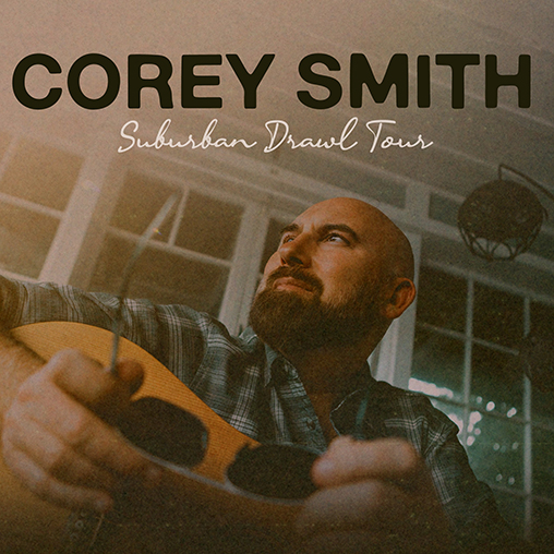
More Info for Corey Smith
SaturdayApril 10, 2027

Corey Smith

More Info for The Tekalli Duo
TuesdayApril 13, 2027

The Tekalli Duo

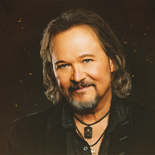
More Info for Travis Tritt
FridayApril 16, 2027

Travis Tritt

More Info for Home Free
SaturdayApril 17, 2027

Home Free

More Info for JD Cable
ThursdayApril 29, 2027

JD Cable

10x10 Series

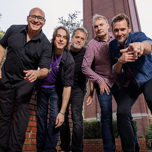
More Info for Sister Hazel
FridayApril 30, 2027

Sister Hazel

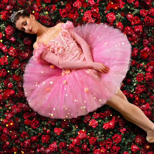
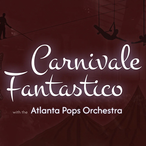
More Info for Carnivale Fantastico
SaturdayMay 1, 2027

Carnivale Fantastico

with the Atlanta Pops Orchestra

More Info for Dalton Jones and Cooper Walker
ThursdayMay 6, 2027

Dalton Jones and Cooper Walker

10x10 Series

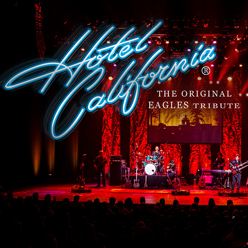
More Info for Hotel California
FridayMay 7, 2027

Hotel California

The Original Eagles Tribute

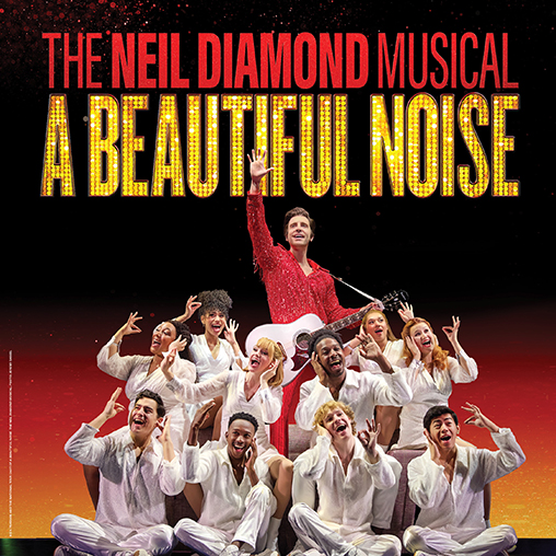
More Info for A Beautiful Noise: The Broadway Musical
ThursdayJuly 15, 2027

A Beautiful Noise: The Broadway Musical

The National Broadway Tour

All Events

Upcoming Events

More Info for Lana White & The Heights
FridaySeptember 11, 2026
Sponsor Inc.

Lana White & The Heights

This is Tagline

More Info for Ramble Tamble: The CCR Experience
FridaySeptember 18, 2026

Ramble Tamble: The CCR Experience

More Info for Melissa Etheridge
SundaySeptember 20, 2026

Melissa Etheridge

RISE

More Info for Lonestar
ThursdaySeptember 24, 2026

Lonestar

More Info for Vitamin String Quartet
MondaySeptember 28, 2026

Vitamin String Quartet

More Info for Lightwire's Tortoise & The Hare
TuesdaySeptember 29, 2026

Lightwire's Tortoise & The Hare

More Info for Dionne Warwick
ThursdayOctober 1, 2026

Dionne Warwick

with the ATL Pops Strings Ensemble

More Info for Jersey Boys: The Broadway Musical
SundayOctober 4, 2026

Jersey Boys: The Broadway Musical

The National Broadway Tour

All Events

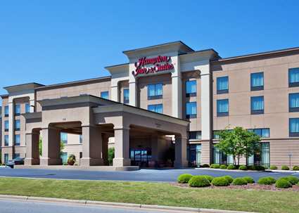
Hampton Inn & Suites Oxford-Anniston

210 Colonial Drive
Oxford, Alabama 36203
Phone: 256-831-8958

Set in the foothills of the Blue Ridge Mountains, the Hampton Inn & Suites Oxford-Anniston hotel is ideally located for exploring Alabama's natural beauty and exciting attractions. Situated just off Interstate 20 between Birmingham, Alabama, and Atlanta, Georgia, our Oxford hotel is also just minutes from Anniston, AL. Experience auto racing excitement at Talladega Superspeedway.

Map

News

FridayDecember 12, 2025

Celebrate the Season with Christmas Movie Magic at OPAC

Grab the kids, call the grandparents, and bring the whole family to the Oxford Performing Arts Center for FREE holiday movies December 21-24!

More Info
SundayDecember 7, 2025

Trisha Yearwood Concert Update

More Info
FridayOctober 17, 2025

Larry K. Martin: “Ephemeral Eden – Stories Behind the Paintings"

Step into the world of wildlife artist Larry K. Martin at “Ephemeral Eden – Stories Behind the Paintings.” Hear the stories behind his…

More Info
ThursdayOctober 16, 2025

OPAC to present twelfth annual Christmas Movie Festival

The Oxford Performing Arts Center is proud to present its annual Christmas Movie Festival for the twelfth year in a row.   The festival…

More Info
ThursdayDecember 7, 2023

OPAC to present tenth annual Christmas Movie Festival

The Oxford Performing Arts Center is proud to present its annual Christmas Movie Festival for the tenth year in a row.   The festival will feature…

More Info
MondayOctober 5, 2020

Next Steps

More Info
MondayDecember 18, 2017

OPAC Winter Holiday Hours

More Info
WednesdayMarch 2, 2016

News article with all fields filled out

Lorem ipsum dolor sit amet, consectetur adipiscing elit. Duis dictum, urna eu faucibus mollis, arcu nulla dignissim mi, eu bibendum nibh dolor at tortor.…

More Info
WednesdayMarch 2, 2016

Has Media - News Title Goes Here

Lorem ipsum dolor sit amet, consectetur adipiscing elit. Duis dictum, urna eu faucibus mollis, arcu nulla dignissim mi, eu bibendum nibh dolor at tortor.…

More Info
WednesdayMarch 2, 2016

No Media - News Title With Long Title to Wrap

Lorem ipsum dolor sit amet, consectetur adipiscing elit. Duis dictum, urna eu faucibus mollis, arcu nulla dignissim mi, eu bibendum nibh dolor at tortor.…

More Info
WednesdayMarch 2, 2016

Thumbnail Only - News Title Goes Here

Lorem ipsum dolor sit amet, consectetur adipiscing elit. Duis dictum, urna eu faucibus mollis, arcu nulla dignissim mi, eu bibendum nibh dolor at tortor.…

More Info

Slideshow

Sample Slideshow Image
Taylor Swift - Cardigan

Extras